Custom Options
A foundational element of the Hermes iteration of our website was to provide the ability to resize elements on a webpage based on a grid structure which allows for much more customization. The grid is made up of twelve columns that go across a webpage from left to right.
Editing Grid Sizes allows you to customize how much space multiple pieces of content take up on the page side-by-side. For instance, arranging text beside an image often means adjusting how much of the grid both the text and the image take up so that they can seamlessly appear next to one another.
The following rows and content regions allow for this customization: Modular Content Row, Feedable Content Row, Floated Content, and Content Regions on a page.

Modular Content Row
Using the Modular Content Row, you can arrange multiple types of content side-by-side on landing pages and secondary pages. Content Regions available in this row include: Header Only, Text Region, Image with Caption, Video, Slideshow, Attached Content, Promos, Calendar Item, and Story Item.
To get started, select “Modular Content Row” under the Row Type menu and add at least two Content Regions to the row. Inside each Content Region is a Content Region Grid Sizes menu.
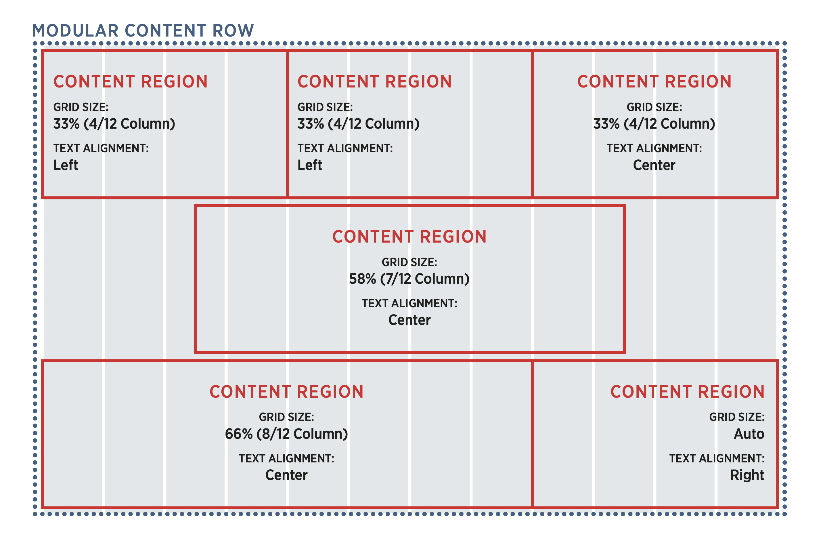
Using Grid Sizes
Open the Grid Sizes menu for each Content Region and select the number of columns you want to assign to them in Mobile, Tablet, and Desktop. For mobile, it is best practice to assign the grid size to 12/12 columns, letting each piece of content take up the full width of the screen. For Tablet and Desktop, a percentage slightly above or below 6/12 columns when arranging two or more Content Regions on the same row.
For each Content Region, you will have to select a separate grid size. Their grid size columns must add up to 12/12 columns to appear in the same row. Once all 12 columns are filled, subsequent Content Regions will move to a new row. For instance, a Header Only content region set to 12/12 columns followed by a Text Region set to 6/12 columns will show the Header Only content directly about the Text Region content.
Selecting Auto within the grid size menu of a content region will automatically fill any remaining space with that row. Auto is selected by defaulted if no grid size is selected.
The Content Region Text Alignment menu is also useful for setting how you would like text to be justified within the context of a Modular Content Row. Select Left, Center, or Right, as you see fit.
We encourage you to take time to practice with grid sizes, and suggest publishing to QA whenever possible to preview your page before publishing to the live site.

Feedable Content Row
The Feedable Content Row, which can display Feedable Content on both landing pages and secondary pages, can also be customized. Whether you are setting up a story feed or an events feed, you have the option to determine the size of each story or event that appears. You will see this customization under the Feed Item Grid Sizes menu.
In this instance, you only have to select your grid sizes once for the entire row. The number of columns you select will apply to each story or event in your row. As seen in the above image, selecting 3/12 columns displays 4 events on a single row.
Content Region
The Main Content Region of a secondary page can also be customized with Content Region Grid Sizes. These function similarly to the Modular Content Row. Please refer to the Grid Sizes instructions above.
Floated Content
Floated Content on a secondary page can be customized using the Floated Content Grid Sizes menu. Follow the Grid Sizes guidance above, being sure to select grid sizes under both the Floated Content Grid Sizes and Content Region Grid Sizes menus. Note that the grid sizes for Floated Content are a percentage of the Content Region's grid sizes.